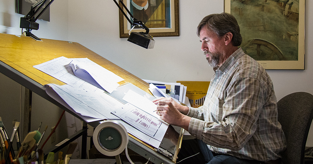
What does art have to do with learning? The team that creates your homeschool curriculum is much more than our Distance Learning teachers and writers. We also have experienced designers who carefully consider how the look and layout of a textbook affect a child’s learning. We’d like to introduce you to someone who plays a vital role in shaping our textbooks.
Del Thompson: Lead Artist
Illustrating Learning in Textbooks
Del is a man who tries to approach everything in life with passion and joy. He first started working at BJU Press in 1978 as an art and design student. He took a job in paste-up—putting together textbook pages by gluing clippings of text and images to cardstock—and soon became a regular student worker. In the summer of 1979, he became an illustrator. He found many opportunities to apply what he had learned in class to his work, and that process was vital to his education. One of his favorite recent projects was the K4 Bible cards.
Working on the K4 Bible cards seemed like a dream job to him. As an illustrator, he embraced the opportunity to challenge artistic traditions in Bible story art. For example, Bible scenes often show Jesus and Abraham wearing the same kinds of clothes, but would a man from Ur around 2000 BC and a Nazarene of the first century have dressed the same way? You might find some of his corrections to typical representations of Bible times in the Bible Truths K4 Teaching Cards.
 Making Art Do More
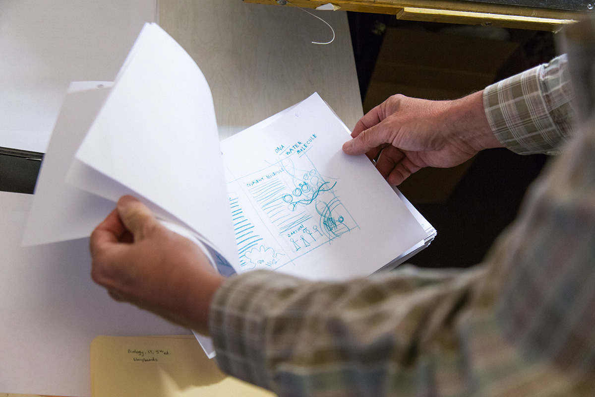
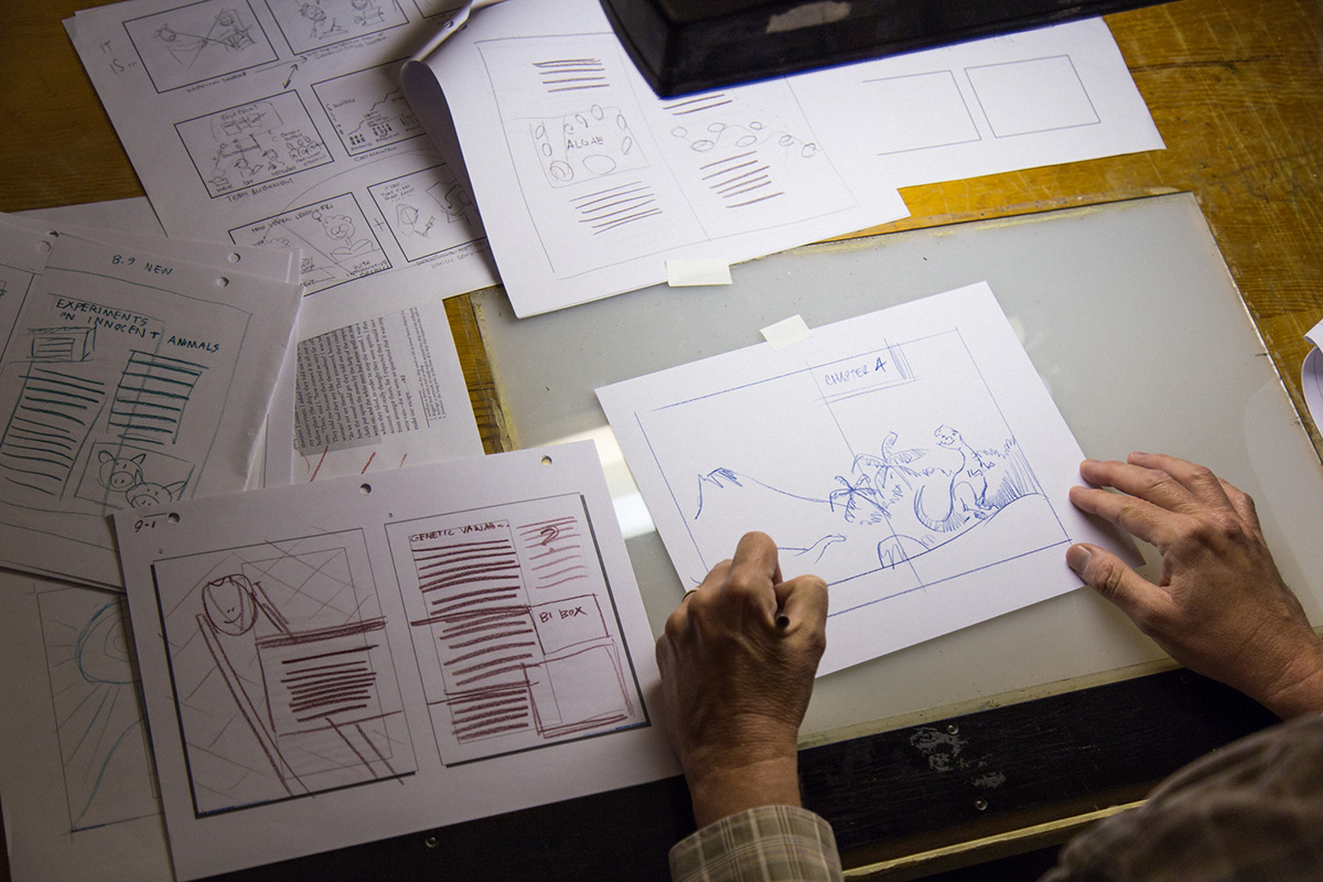
In 2011, Del became the art and design manager over the art department. Since then, he has been unable to do as much illustration work as he would prefer, but he has brought together the textbook development teams in a special way by introducing the concept of storyboarding—and adding more snack times. With storyboarding, the designer lays out a project from start to finish to see how it works as a whole. The film industry and other publishing companies often use storyboarding, but it hasn’t always been applied to textbook creation. Pushing the content development teams toward storyboarding introduced them to opportunities for working together that go beyond the efficient.
Del says, “If you know what you’re doing from beginning to end, you can build toward that ending in a much more intelligent fashion.” Content teams now have the opportunity to work together to lay out the strongest product possible. Additionally, Del was able to help everyone on the art and design team to see imagery not as decoration, but as content. Sarah Lompe, one of his illustrators, was able to work with the writers to transform what would have taken several pages to explain into a beautiful piece of art that fused words and images to convey the concepts. You can see this throughout the Biology (5th edition) student text!
 Empowering Learning Through Art
Del thinks that art in a textbook should travel “the shortest distance from the writer’s brain to the student’s,” which means he doesn’t want to make the content harder to understand. His efforts have thrown new light on the notion of academic rigor. Academic rigor doesn’t mean making concepts harder to learn. Academic rigor means including difficult content but making it attainable for young minds.
He believes that “if a book is put together with a lot of joy (like when you read a novel, and somebody is having a blast writing it), somehow it bleeds through the type. And if a textbook is put together with the same enthusiasm, it will somehow bleed through that text in a way that it becomes more than the sum of its parts.” And that is what Del and his team strive for in each of the textbooks they work on.
Your children may not always realize that the design of their textbooks is helping them learn. They may appreciate the pictures and be thankful for white spaces, but it’s not always obvious to them that those pictures and white spaces teach just as much as the text itself. The next time you’re noticing the color and beauty of your textbooks, take a moment to consider how that color and beauty helps your children to learn better.
