 If you haven’t been there recently, let me invite you to visit our homeschool website! It’s been redesigned from the ground up by our amazing web team to make your shopping experience even easier. Here are three specific changes our team has made with you in mind.
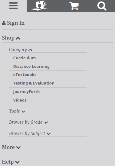
(1) We realize that many of you are browsing our homeschool website from your mobile devices, so everything on our homeschool website is mobile friendly, right down to the ordering process. You can now choose to shop from your phone, tablet, or computer. And don’t worry if you’re unable to complete the ordering process on one device, the same simple navigation and easy-to-read details are available on any device you choose to use on your next visit to the site.
• • • • •

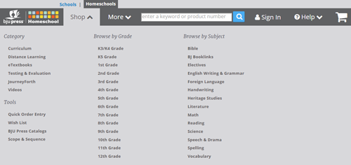
(2) Find the products you’re looking for with a single click. Simply select the Shop button located at the top of any page, and you’ll find a drop-down menu that divides our materials by category, grade, and subject. There’s even a Tools section for quick order entry, your wish list, and more!
• • • • •

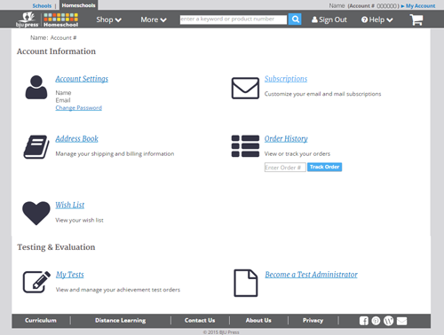
(3) The new ordering process is also smarter. It remembers specific details so that you don’t have to. Once you’ve entered your shipping information, those details are retained for easy selection the next time you order. There’s no need to fill in the forms again unless you want to change something. But don’t worry, we use that information only to fill your order. (We’ve posted a BJU Press Privacy Statement online.)
We hope these changes to our homeschool website make your shopping experience more enjoyable and less time-consuming because we know you’d rather be spending quality family (and learning!) time with those who matter most. Experience the changes for yourself at bjupresshomeschool.com.
Leave a Reply